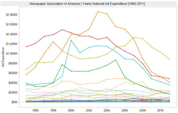
I work in research, so I’m accustomed to looking at endless columns and rows of data for extended periods of time. Unfortunately, no matter how long you stare at the raw data, it’s very difficult to build a cohesive story out of all those digits and decimals. Humans are inherently visual creatures – it’s the reason we repeat the old adage that a picture is worth a thousand words. So, when I came across some recent data from the Newspaper Association of America regarding ad expenditures from 1995 through 2011, I knew there was a narrative to be found hidden behind their wall of numbers. Using Tableau Public, I put together an interactive graph that allows you to really see what has been happening in ad spending during the last 15 years. You can filter out information to compare categories, hover over individual line segments to view time specific information, and even adjust the date range to focus on smaller year spans. The more you interact with the data, the more stories you can reveal. For instance, if we look at Public Service Utilities/Telecommunications ad expenditure for the entire period you’ll notice there is a sharp rise in 1995 (the year when now famous internet services IMDb, Amazon, and eBay first launched) through 2003 when there is an equally sharp decline (coincidentally, the same year that enough people had finally signed up with ISPs that social networking starts up with MySpace). Of course, there are other stories and interpretations to be found, so have a go at working with this interactive visualization and make use of all that data.
[click on the image to open the dashboard in a new tab]